
A conversation with designer and artist behind the TITLES protocol contract art, Andreas Gysin
A few months ago during the development of the our next protocol, we set out to commission a series of artworks that could bring to life the ideas coded into the new protocol that would be displayed and distributed via the protocol itself. After some research, we found out about Andreas Gysin’s practice and worked with him on a series of ASCII works.
Few creatives seamlessly blend the art of typography, graphic design, and computational art quite like Andreas Gysin. Today, we’re excited to share an interview with Andreas, where we dive into his unique research based approach to design, his reluctancy to call himself an artist, and behind the beautiful work he produced for us at TITLES. The following is a transcription from a recorded conversation with Andreas…

Who is Andreas Gysin? Tell us about your practice as an artist and graphic designer…
I started as a graphic designer, studying typography, print and illustration—not even digital or screen-based work. After finishing my studies in 2000, I opened a studio with a friend working for a variety of clients.
After launching the practice, we realized that there was potential in computational design. We didn't intentionally specialize, but we tended towards parametric and generative design, exploring various possibilities for ourselves and for our clients.
In this sense, you could call us “artists” because we worked on our own projects exploring and researching the possibilities of generative design applied to print. But we also discovered a demand from clients for our experimental knowledge in more commercial settings or contexts that required a specific or unique type of communication.
The studio operates on two tracks, separated only from an outside perspective: we have client work (commercial) and self-initiated projects (research). Internally, though, our approach and methodology remains essentially the same for both; from the point of view of the process there isn’t any difference.
Tell me about your roots in type and progression into programmatic type through ASCII…
Since the early days of personal computing, especially in the MS-DOS and Commodore 64 era, I’ve always been fascinated by ASCII art. I got my first opportunity to create this kind of art when I was commissioned by an electronic musician who worked intensely with older computers like Ataris.
He had an intriguing approach to music, using algorithms and randomness in his pieces. He wrote software to generate audio, and each time he executed the program, the sound, rhythms and melodies would be slightly different due to random variations.
For the commission, I was asked to create the album cover and a video clip for the music… I wanted to incorporate the notion of randomness in the visual output too so the “video clip” became a real-time program that would run in the browser. The clip was slightly different each time. The subject of the clip were characters and numbers flipping around like airport tables (an early obsession of mine). I ended up designing the characters as hairline vector shapes based on a very simple grid… The same “font” was then used for the album cover.
The next project came when a Belgian cultural institution commissioned our studio to design a poster for a season of events around digital art and music. We decided to continue to explore the use of text-based imagery with the animation and composition techniques that originated from the previous one.
We initially designed these posters but proposed that they could also be animated. We prepared both printed street posters but also versions for screens. Social media wasn't as prevalent then, but we envisioned displaying these in online contexts and on displays around the event. The project didn’t go as we would’ve liked so it was abandoned but we learned a lot in the process. It was exciting to create and explore these algorithms.
Years later, during the COVID pandemic and the rise of NFTs, I decided to revisit this unfinished chapter: I wanted to continue to explore these topics and themes with the constraints of working only with text. I wanted to see how far I could push this idea, to find its limits, and to see if I could continue recycling and reinventing the concept without it becoming stale. What I find most interesting is that both, the very beginning and this latest iteration for TITLES, were commissioned projects.
Do you find that a lot of your good work comes from these kinds of commissions?
It’s much easier to work on a commissioned project because you have a context, specific requirements, and limitations—like a budget or technical limitations for example. You might say, “This project needs to fit within this small budget” or “It requires this specific context or tech.”
Every project is important in its own way. It’s not that I automatically insert ASCII art into everything. I produced many works (the majority!) that have nothing to do with ASCII art or computational techniques—sometimes they’re not even generative at all. The context, or rather the project itself, is king: the project determines which direction to take.
To elaborate on this context, I've become known as “the ASCII guy” in some circles. People approach me with specific requests like, “I need this for my project.” It's almost as if the natural process of design has been flipped—the client already has an intuition that their project needs a particular kind of proposal. They need “this.”
They select me because they know I can deliver what they’re looking for. However, this wasn’t my typical approach until very recently. It can be a bit of a trap for a designer because you become “the guy with that style,” and then you’re expected to deliver that style consistently. But every project is different, so it's not appropriate to always have the same answer for different needs. Of course, this particular project for TITLES is an exception :)
What I’m hearing is this commission-first constraint allows for a specific kind creative space. So when we came to you asking for a series that stretched across our protocol contracts, what was your reaction to that?
You selected me to work on the textual part of the contract, so his aspect was already decided; it was the whole project. I was happy and satisfied. I thought, “Okay, a big decision has already been made.“ So what remained for me as to choose to accept it or not. Of course, I had to accept it because it was too juicy to pass up.
Then there was a second constraint: the deadline was very short-term. In a way, it was easy for me to accept it also because of the brief duration.
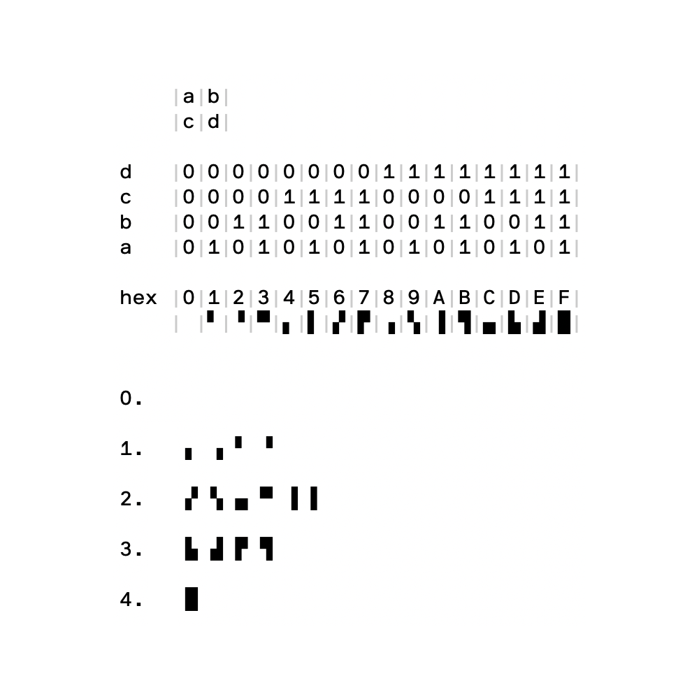
Then there was a third constraint, which was a bit more artificial. I looked on Etherscan to see how the code of the smart contracts appears and is displayed in this context. What space could I work within? The code is presented with the first 25 lines visible, with the width being more or less free. So I decided the piece needed to be 25 lines high and a certain width.
I chose 80 columns—not a casual number: older displays had an 80 by 25 character grid. Instead of inventing a random number, let's use something with a history of displaying text on computer screens.
I am curious to hear about the process of working through this. Where did you struggle when you were in the meat of it all?
Well, I always struggle with projects, even if I’m excited about them. There's always this kind of pain, but perhaps the masochistic part of me enjoys it. On your side you described the project very well, which is quite rare! You explained that there’s a relationship between several parts connected in specific ways. You sent me a diagram that I studied, trying to understand exactly what was going on…
I had to consider what kind of idea, approach, or direction would underline or enhance this, and how I could create a relationship between what I’m doing and this context. We had already delimited the space, so the next step was to create content that fits into it. My initial idea was to visualize the interconnection between the parts. I wanted to create a large piece and then divide it into smaller components, with each contract having a piece of it.
Without having a precise direction, I had to start because time was already running out. I came up with the idea of a drawing system that I could manipulate by hand but also with some helper scrips, allowing me to compose pieces. It worked, more or less, and it was interesting to build this tool, but I also felt it wasn’t quite the right solution.

That’s why at the last minute I put together a second proposal. There was also this other idea which I found more adherent: a big “machine”, something strange that you can’t really recognize, with soft interconnected shapes, but you always only see parts of it.
I remember that when I sent you the second proposal, you also reacted. Because it was made in such a short time, sort of last minute, you gave me one more week. You said: “Hey, explore this a little bit further.” I was glad that you gave me this possibility, a chance to make the second direction it a little bit better.
What’s cool to me about this concept is the DNA component and how this plays out in practice as TITLES is used more. In fact, in just the past few days it’s been duplicated 3,500 times. Pretty cool, huh?
It is.

One thing that struck me is that you had built an editor that produced work continuously where you sampled the end outputs. Why do you do that?
First of all, that’s how I work. I build a tool around an idea. Why go through this huge effort? Because I truly believe in an iterative process—it’s a fundamental part of my approach.
This is especially crucial in situations like this, where the idea isn’t clear from the outset. I know there’s a direction—or maybe two, as in this case—that I want to explore. It’s an intuitive approach, not necessarily a cold, calculated one.
I hoped that maybe one or both of these two directions would work. Without knowing exactly, I needed to build a system that allowed me to explore.
It’s not a generic tool, it’s not something where you can create any kind of ASCII art or any imaginable output. The seed of the idea is embedded in the tool itself. It allows you to create a specific range of variations around the main concept only.
But here's where it gets exciting—and why I enjoy this process so much: when you build a tool with various parameters, at a certain point, you tweak a few things, and suddenly an unexpected image or result emerges. The tool allows me to be surprised during the process.
It contains possibilities that I couldn’t imagine when I was building it. That’s why it works so well for me. You also mentioned in our first meeting and in the brief that there might be more in the future. So I thought that if we need to continue we wouldn’t need to sit down and reinvent everything from scratch. Let's build a system that can produce several images, now we’re set for a couple of years.
Totally. It's cool to think about this tool for producing work for our contracts overtime as the product grows and refines over time. I am curious what I didn’t ask you today that you would love to add about this project?
This is the only place the project could exist. When I work on a communication project with a large scope—let’s say, a festival, which I mentioned before—you usually build a system that extends to a wide range of media and supports. Even when you build a tool, it's part of a larger system.
For a festival, you have all the print materials: posters, small event books, and even bracelets for entry. You can put the image or concept on t-shirts, and people working there might need special hats. So you have this wide array of possibilities where the visual communication system is applied.
I wondered if there was a context outside of this where it could be applied in your firm. But then I answered myself: no, this is the only exact space where this thing needs to live. Because it was made for this, it would be a sort of perversion to pull it out and start applying it to something else.
Thank you for your time Andreas. We’re super excited about how this project took shape and look forward to working with you again in the future.
Thank you!
If you’d like explore more of Andrea’s work you can check out his website, here. If you’re curious to see some of the contract artwork live on Etherscan, you can take a look here: Source, Registry, Collection, and Router.
Much love,
— TITLES